Product
ECLIPSE Finance Apps (Catalogue, Payments, FA, ESP)
Time
Role:
UI/UX Designer (Design System + Component Engineering)
Timeline:
2024
Team
Senior UI Designer, Developers,
PM
Tools
Figma,
Storybook,
WCAG 2.2,
Component Tokens
Purpose
After a major theme uplift across all finance apps, the team needed a unified, scalable design system to ensure consistency, reduce inconsistency, and provide a single living source of truth for all components.
My Task
My task was to rebuild components, consolidate variations, and create a clear, maintainable library used across multiple products.
Before this project, components across the Finance suite were:
inconsistent across products
duplicated with no naming conventions
varied in spacing, colours, and states
causing developers confusion
difficult to maintain when rules or layouts changed
making new features slow to design and review
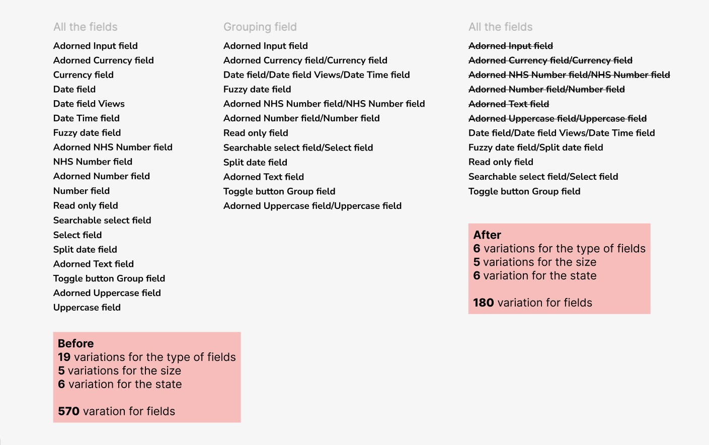
The biggest issue was that components had exploded into unnecessary variations.
For example:
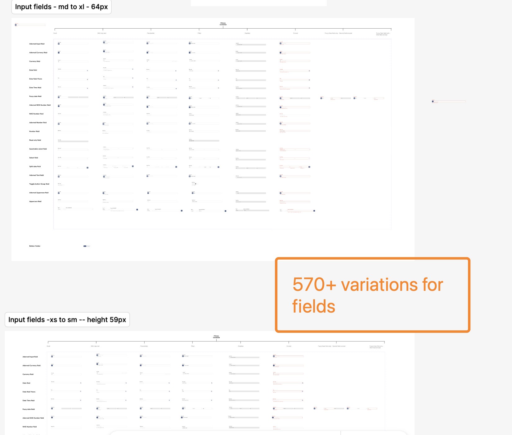
Fields had 19 types × 5 sizes × 6 states = 570 variations.
This complexity made design slow, error-prone, and non-scalable.
The team needed a system that:
reduced complexity
ensured all apps looked and behaved the same
was easy for designers to use
was clear for developers to build from
could evolve with new themes or requirements
Create a single unified design system for all finance apps
Ensure components support all required states and behaviours
Standardise look & feel after theme uplift
Improve speed and consistency across teams
Storybook components already existed — Figma needed to match 1:1
Some legacy UI patterns still had to be supported until phased out
Developers needed extremely clear specs and reusable logic
Components must work in long-scroll pages and complex UIs
Use token-based spacing
Align to finance app theme
Full WCAG 2.2 compliance
Provide documentation + examples
Reduce component variations
Create atomic component structure
I reviewed:
all existing Figma component libraries
developer Storybook components
legacy UI used in Payments, Catalogue, and Financial Assessment
PM and developer pain points
accessibility issues across existing screens
inconsistencies in headings, icons, table usage, spacing, fields, and forms
Key insights:
Inconsistent behaviour confused developers → slowed down implementation
Designers were remaking components instead of reusing them
Storybook and Figma didn’t match → friction between teams
Accessiblity issues appeared due to duplicated and ungoverned styles
Component naming was unclear and ambiguous
Variations had ballooned out of control
All of this shaped the direction of the new design system
Goals
Reduce cognitive load for designers and developers
Consolidate components into minimal, powerful variants
Create scalable patterns for future products
Standardise spacing, colours, types, states
Ensure WCAG compliance
Design Principles
Clarity: predictable naming & structure
Consistency: match Storybook + design system rules
Scalability: minimal variations with smart properties
Accessibility: readable, contrast-safe, focus-visible
Efficiency: fewer clicks, fewer overrides, fewer components
1. Audit & Extraction
I extracted all components used in finance apps:
Fields
Buttons
Alerts
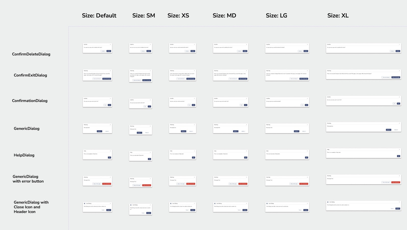
Dialogs
Toasts
Tabs
Tables
Headers
Breadcrumbs
Side navigation
Transfer lists
Icons
Form inputs
Then mapped duplicates, inconsistencies, spacing issues, and missing states.
2. Rationalising Variants (Major Win)
The biggest complexity was the Fields component.
Before reduction:
19 types × 5 sizes × 6 states = 570 variations
After rationalisation:
6 types × 5 sizes × 6 states = 180 variations
This was achieved by:
identifying repeated behaviours
merging similar types
using boolean variant logic
using Figma properties instead of separate variations
creating shared foundations (labels, helpers, error states)
This reduced:
design complexity
memory usage
developer handover confusion
maintenance effort
And it made designers much faster.
3. Building Components
For each component, I rebuilt:
states (default, hover, focus, error, disabled)
responsive behaviour
slot content
icon rules
spacing tokens
auto-layout logic
interactions + keyboard rules
annotation guidelines
4. Documentation
For each component, I wrote:
guidance
do/don’t
usage rules
accessibility rules
examples
variants + behaviour
This is what turns a component library into a design system.
I aligned every component to:
token-based spacing
8px grid
accessible colour tokens
updated typography
Storybook specs
consistent icon sizes
predictable interaction patterns
accessible form layouts
This ensured parity across:
Catalogue
Payments
Financial Assessment
During the rebuild, we identified mismatches between Figma and Storybook.
To resolve this:
I collaborated with developers to align behaviours
Clarified naming conventions
Suggested changes to Storybook patterns where needed
Ensured all themes applied consistently
Provided annotated examples of expected behaviour
This strengthened cross-team alignment and improved implementation quality.
The design system is actively used across finance apps.
I am supporting:
component refinement
developer queries
new features that rely on these components
continued accessibility testing
future expansion of tokens and themes
Reduced component variations by a huge margin (570 → 180 for fields)
Faster design workflow
Decreased developer confusion
Reduced implementation errors
Ensured cross-product consistency
Improved accessibility
Created scalable foundations for future themes and apps
This project deepened my expertise in design systems, scalable structure, and atomic component thinking.
I learned how to balance constraints, simplify complexity, collaborate closely with engineering, and bring clarity to a previously fragmented ecosystem.
This work strengthened my design maturity and confidence in system-level thinking — and demonstrated my ability to create impact across multiple products, not just individual screens.