
Product
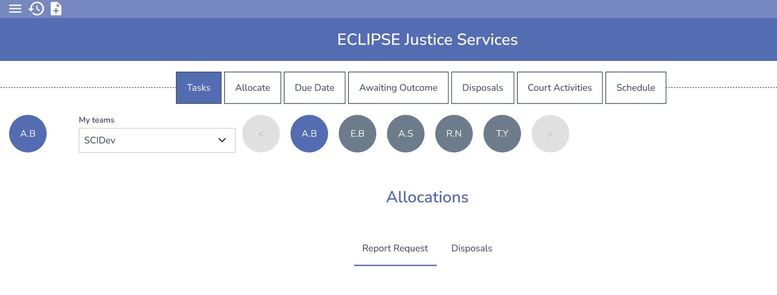
ECLIPSE Justice Services – Allocation Screen
Time
Role:
UI/UX Designer (redesign)
Timeline:
2024
Team
Product Manager, Developers,
Technical Writer, Justice Service SMEs
Tools
Figma,
Design System Components,
WCAG 2.2
Purpose
Justice Services staff process high volumes of tasks every day. The allocation screen determines how quickly tasks are assigned, reviewed, or actioned — making filtering a mission-critical workflow.
My Task
My task was to simplify the filtering experience, reduce cognitive load, and create a faster, clearer interface that supports real-time work.
Users struggled with the existing Allocation screen because:
User initials icons were ambiguous (multiple staff had the same initials)
Users had to hover to view full names → slowed them down
Horizontal scroll for user icons disrupted the workflow
Filtering logic was split across four separate UI elements
Cognitive load was unnecessarily high
No clear hierarchy — users didn’t know where to begin
Multiple filtering mechanisms overlapped
Accessibility issues (low contrast, small targets, hover-dependency)
This made task allocation slower, less accurate, and frustrating for high-volume users.
Improve filtering efficiency
Reduce user confusion
Enable rapid allocation for high-volume workflows
Maintain consistency across Justice Services tabs
Increase clarity for new staff learning the screen
Some filters must remain due to backend logic
Initials-based logic exists in legacy systems
Must avoid major structural changes unless justified
Tabs ("Report Requests" vs "Disposals") must remain
Ensure WCAG 2.2 AA compliance
Reduce visual clutter
Provide clearer user selection mechanisms
Create scalable filtering patterns
Align with the ECLIPSE design system
Improve layout and hierarchy
1. Heuristic Evaluation
I conducted a UX review of the existing screens and identified:
Visual clutter
Lack of clear hierarchy
Redundant filtering mechanisms
Ambiguous initials icons
Excessive horizontal movement
Hover dependency for essential information
Inconsistent spacing + target sizes
Filters scattered across the page
Annotated screenshots highlighted issues in detail.
2. User Research (Lightweight)
I carried out informal research through:
Conversations with actual Justice Services users
Discussions with Product and SMEs
Reviewing past support tickets related to filtering
Observing how staff interacted with the screen
Themes identified:
Users were “slowed down” by identity ambiguity (initials)
Scrolling made selection inconsistent
Too many filters → “Where do I even start?”
Modal filters added friction rather than reducing it
Users developed workarounds because defaults weren’t intuitive
3. Synthesis
I grouped insights into problem clusters:
Confusion
No clear starting point. Too much visual noise.
Redundancy
Multiple filters doing similar things.
Slowness
Hover actions, scrolling, and modals added friction.
Visibility issues
User identity was unclear. Filters were split.
Inconsistent patterns
Different tabs behaved differently.
Goals
Reduce cognitive load
Streamline filtering
Improve user identification
Reduce horizontal movement
Increase clarity and hierarchy
Ensure consistency across tabs
Design Principles
Clarity: obvious starting point, visible rules
Simplicity: fewer filters, more unified controls
Consistency: predictable filtering behaviour
Accessibility: eliminate hover dependency, larger targets
Speed: fewer steps to achieve the same task
Exploration & Early Sketches
I explored multiple patterns:
Consolidated filter bar
User dropdown instead of initials
Multi-select chips
Progressive disclosure patterns
Updated tabs with clearer grouping
Simplified filter modal
Wireframes
Options included:
Option A: Unified top filter bar
Clear starting point, all filters in one place.
Option B: User dropdown
Replaces initials icons; clearer identity; searchable.
Option C: Multi-select chips
Inline filter selection with visible states.
Option D: Reduced modal friction
Simplified logic, clearer categories.
I aligned every component to:
token-based spacing
8px grid
accessible colour tokens
updated typography
Storybook specs
consistent icon sizes
predictable interaction patterns
accessible form layouts
This ensured parity across:
Catalogue
Payments
Financial Assessment
Increased spacing for more breathable layout
Reduced number of filter locations
Removed horizontal scroll
Improved touch target sizes
Decluttered the modal
Clearer labels + icon consistency
Standardised typography hierarchy
These improved usability instantly while larger redesigns were prepared
Low developer resource, therefore we propose some Long-Term Improvements and increment on top of the current solution
New unified filtering model
Fully standardised filtering pattern across Justice Services
Rebuild of Allocation flow using design system components
Replace modal with inline filtering where possible
Better cross-screen navigation patterns
Reduce duplication across tabs
These recommendations form the roadmap for V2 of the Allocation experience.
Validated prototypes with Justice Services staff
Prioritise changes with Product Manager
Collaborate with developers for feasibility
Plan multi-phase rollout (quick wins → full redesign)
Refine and test V2 filtering model
Users will benefit from:
Faster task allocation
Reduced confusion around user identity
Predictable filtering patterns
Reduced scanning and horizontal movement
Higher accuracy
Better accessibility compliance
Lower cognitive load for new staff
For the business:
Fewer user errors
Lower support ticket volume
Higher overall productivity
More scalable UX model across the product suite
This project strengthened my ability to simplify complex workflows under tight constraints.
I learned how to balance legacy patterns with modern UX principles, make high-impact improvements quickly, and propose scalable long-term solutions that reduce friction across the entire product suite.
It deepened my confidence designing for high-pressure, high-volume public-sector environments, where clarity and speed make a meaningful difference to users.


